Background:
GoCanvas (formerly 'Canvas') is a mobile forms company that strives to empower businesses across industry to maximize efficiency, using it’s product to create custom business solutions. Due to a number of brand recognition challenges, there was a clear need for an updated company name and logo refresh.
Role: Design Lead & Graphic Designer
Problem 💣
Since it’s inception, GoCanvas has had difficulty with brand identity. Forming as a startup when the old logo was created, the alignment wasn't in sync with current company ideals, brand messaging, and goals. Fast forward to an organization with 150+ employees, hiring hyper growth, and an established client base both domestically and internationally, a need for a new logo became a priority.
Sketching ✏️
Today, GoCanvas has over 150 employees with offices established in the US and Austrailia, and has frequented the Best Places to Work lists of notable publications such as the Washington Business Journal, the Washingtonian, Forbes, and Inc. It was time for a change. The old company name, 'Canvas,' wasn't reflected in the website URL, www.gocanvas.com, and other well-known companies were using the same name. As a result, search engine optimization dropped Canvas to the third page on Google. All of these issues had snowballed and started to impact user clarity on what Canvas is and, more importantly for the stakeholders, started affecting trial signup numbers.
![[fig 01] Sketches](/s/GCLogo_Sketch3.png)
[fig 01] Sketches
![[fig 01] Sketches](/s/GCLogo_Sketch2.png)
[fig 01] Sketches
![[fig 01] Sketches](/s/GCLogo_Sketch1.png)
[fig 01] Sketches
[fig 01] Rough ideation sketches to get familiar with letter-forms and start experimenting with spatial relationships.
The first step was clear; the company had to change the name. In addition to the lack of consistency across web URL's, our sales department would receive calls from people assuming we were another company entirely. After many strategy meetings and due diligence, our CEO agreed—’Canvas’ was to be renamed ‘GoCanvas’. It's important to note; leadership held very firmly to the old logo - a challenge that my product team was aware of going in. We began sketching to generate ideas–good, bad, and ugly.
Plenty of options were created with promise, but there remained a challenge with making sure that the core values of GoCanvas integrated well with a proposed design solution. "Empowering every business to expedite their processes..." A thought crossed my mind. Every business? It seemed impractical. Realistically, each company has its processes and procedures; how can we possibly fit into all those different verticals? To encompass everything, means to have no limits.
Ideation ⚡️
![[fig 04] Shape structure](https://images.squarespace-cdn.com/content/v1/5e6065103f92890cfc414312/1593141802110-KVEZPDMEDKUZBE6J8EQH/Breakdown_1.gif)
[fig 04] Shape structure
This “unlimited” concept became a hot topic of discussion with the team, and we all agreed - the next step was to divide and conquer; Individually, we would refine each interpretation of the idea of "limitless agility" and have a critique. From there, we’d select the most appropriate choice and address anything that was needed.
For my sketch, I wanted to make sure that the identity mark told a story of where the company came from and where it would go, as related to the proposed concept. I started breaking down how the old logo was constructed and looked at it in its geometric form. This led to a more refined solution.
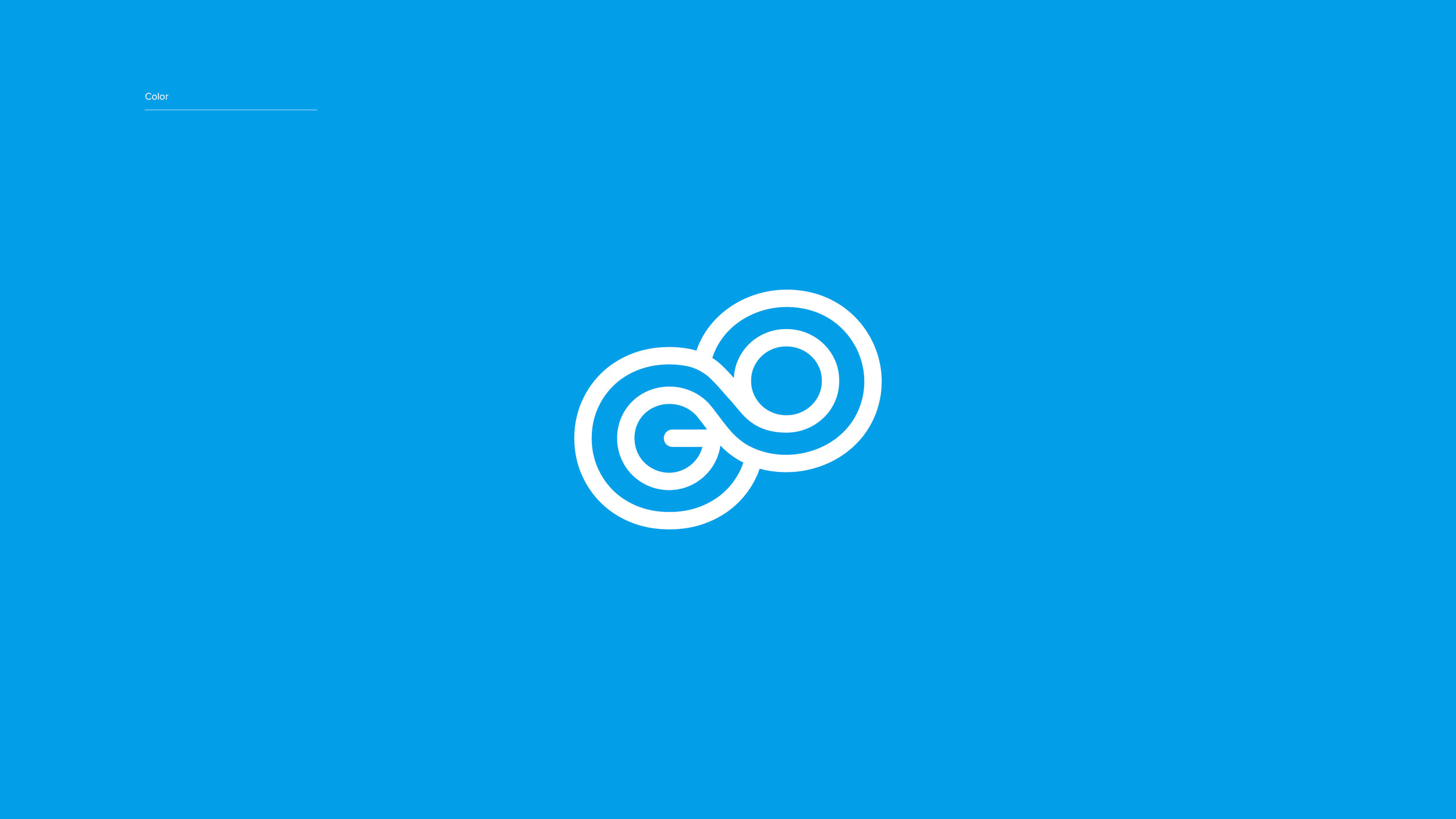
Final Logo

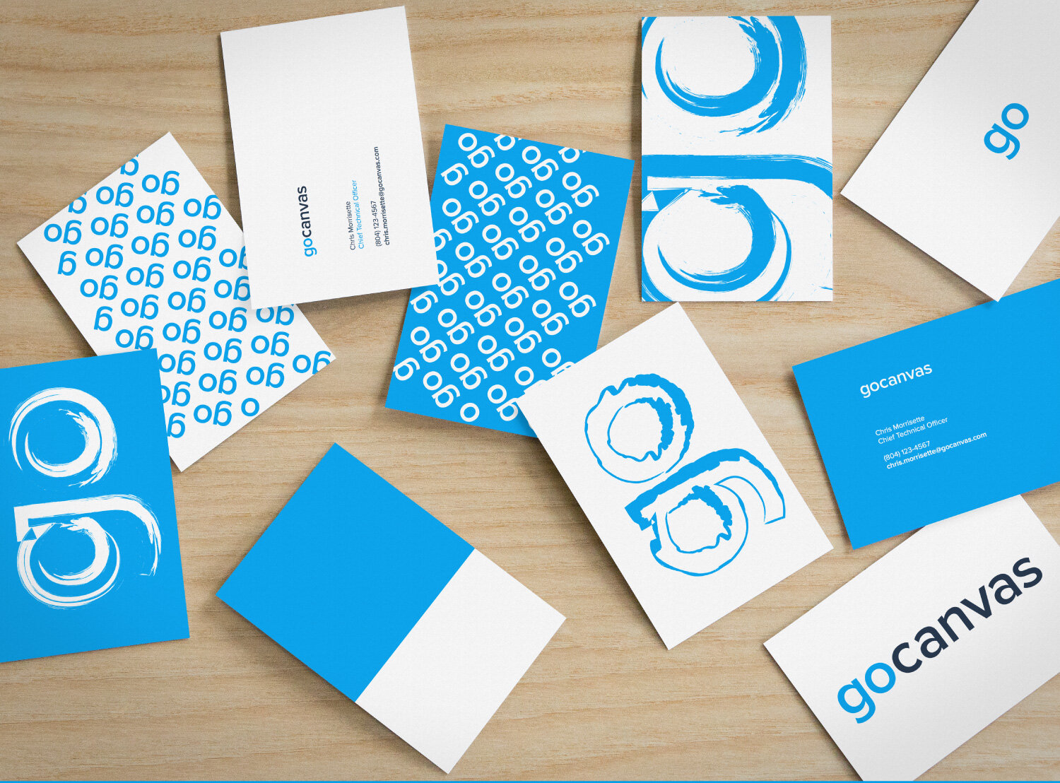
With our updated name, GoCanvas, the combined letterforms of "GO" created the visual with the infinite symbol. I went back to the files and grabbed the circular grid that the old logo was based on, and used it to create simple geometric letters. The biggest challenge was working through how closely the letterforms should follow geometric perfection to achieve a better visual harmony. Too much, and it looked odd. Too little, and the letters started looking misshaped.

Results 🥈
Overall, this project stretched my individual ability to compromise and work with stakeholders. There was a ton of back and forth, quick reviews, and razor-thin time constraints that made spearheading this initiative challenging.
The team also came up with fantastic solutions with the given concept. Together we had in-depth discussions about each of them. Do they build potential for a visual design system to be structured behind it? What should the accompanying typeface be? Does it scale well in different environments? Discussions took place around the strengths and weaknesses of each proposed visual, and ultimately decided on the final logotype.