Background:
Onboarding is a part of the first-time experience that new customers go through to be more efficient when using the GoCanvas software.
Role: UX Designer

Problem 💣
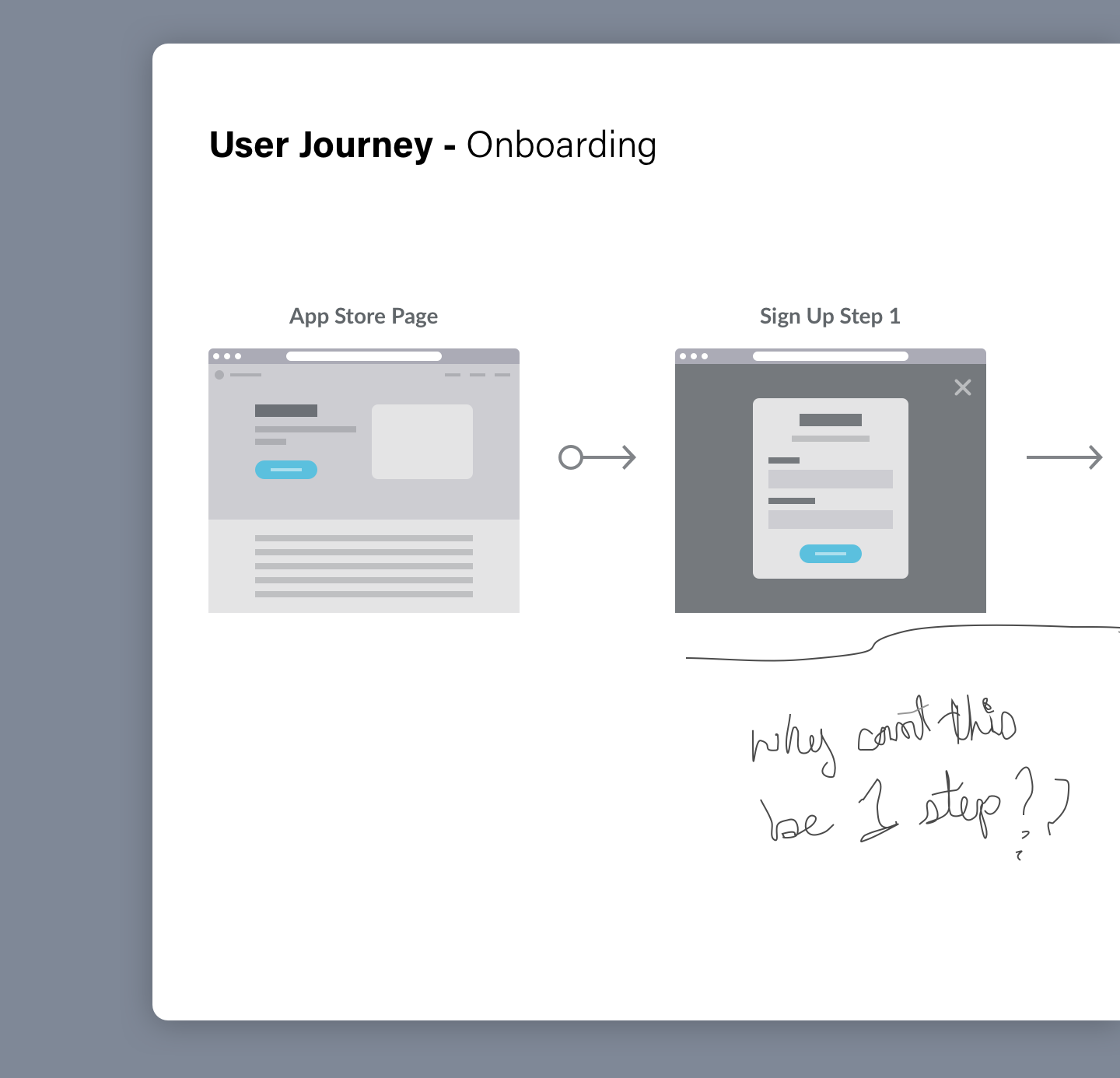
Customers were signing up for GoCanvas and not understanding how the product works.
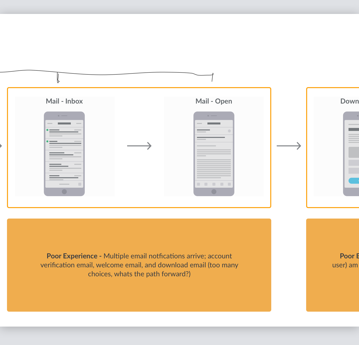
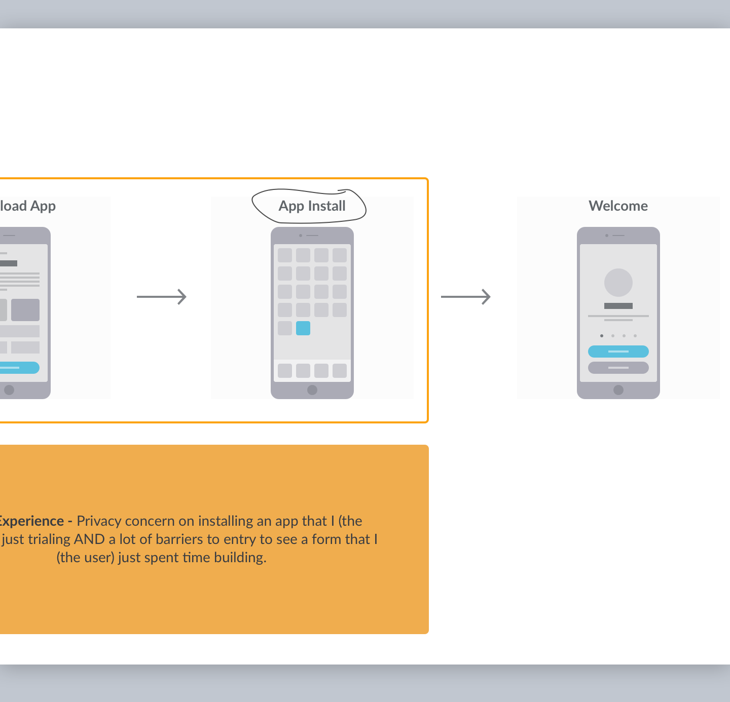
Our team had a significant amount of collected research and data to confirm that the customers understood the overall value proposition (digitize your paper forms = more efficiency), but didn’t know the process to get started with the software (how do I digitize a form using GoCanvas?). As a result, there was a low trial-to-paid conversion rate and a low trial sign-up completion rate.
Long story short; people were giving up.
Project Plan

UX Research Goals
Define pain-points in the sign-up process from existing user journey in the first time user experience
UX Design Goals
Come up with a hypothesis based on research
Create wireframe/prototype solutions based on hypothesis for proof of concept
Deliverables
Wireframes
Prototypes
UX Research ⚡️
After examining the first time user experience on-boarding flow, we realized that multiple touch-points needed to be addressed that were far beyond the initial scope of the project.
We also referenced usability insights and data analytics to triangulate where the most significant gaps in the experience were happening.
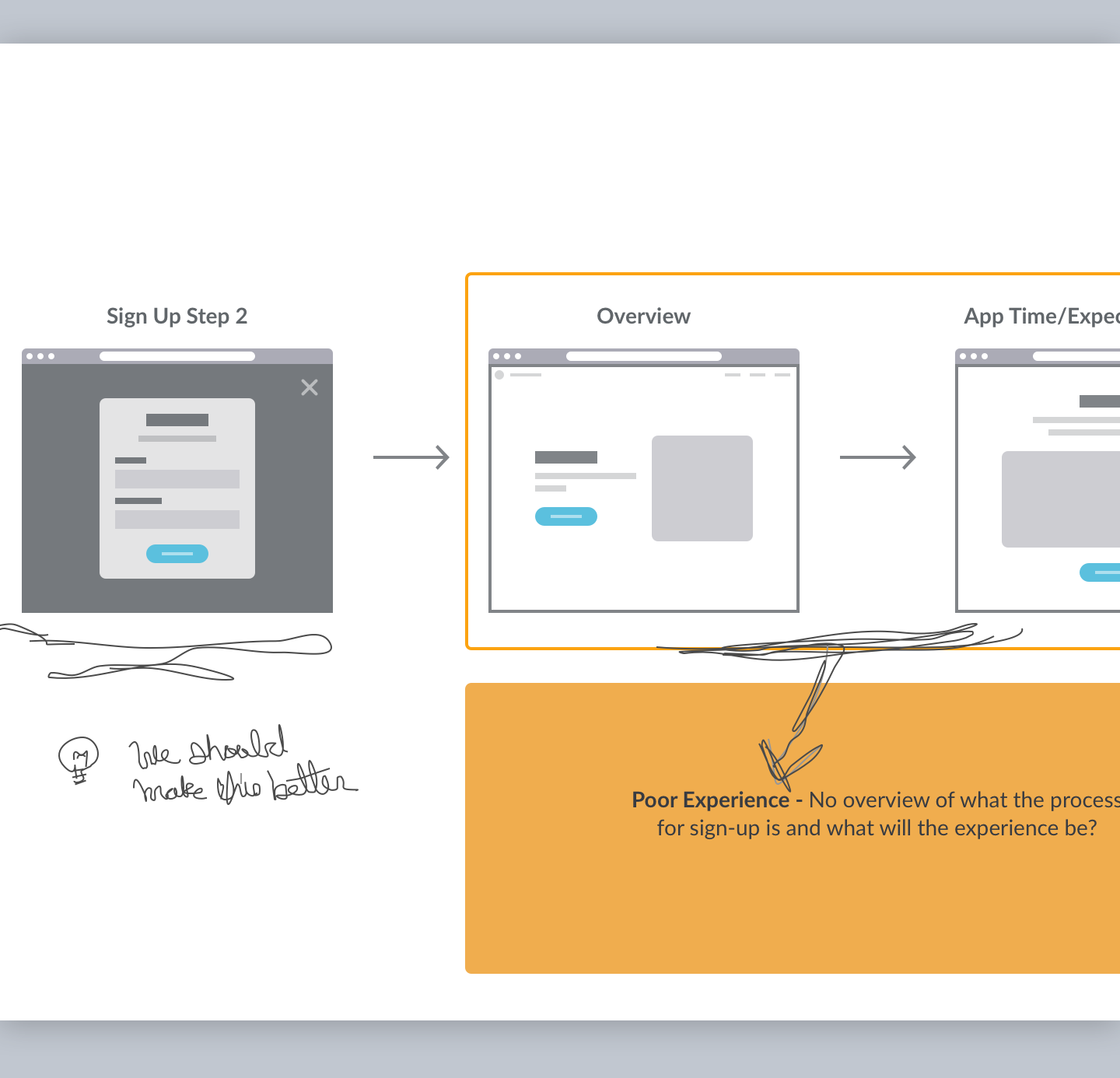
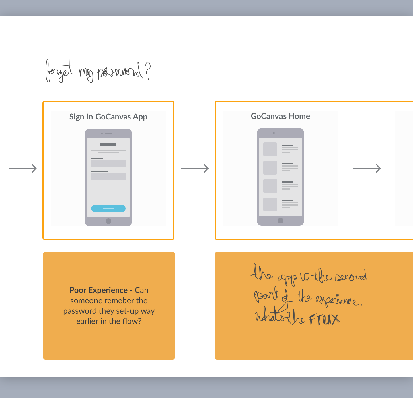
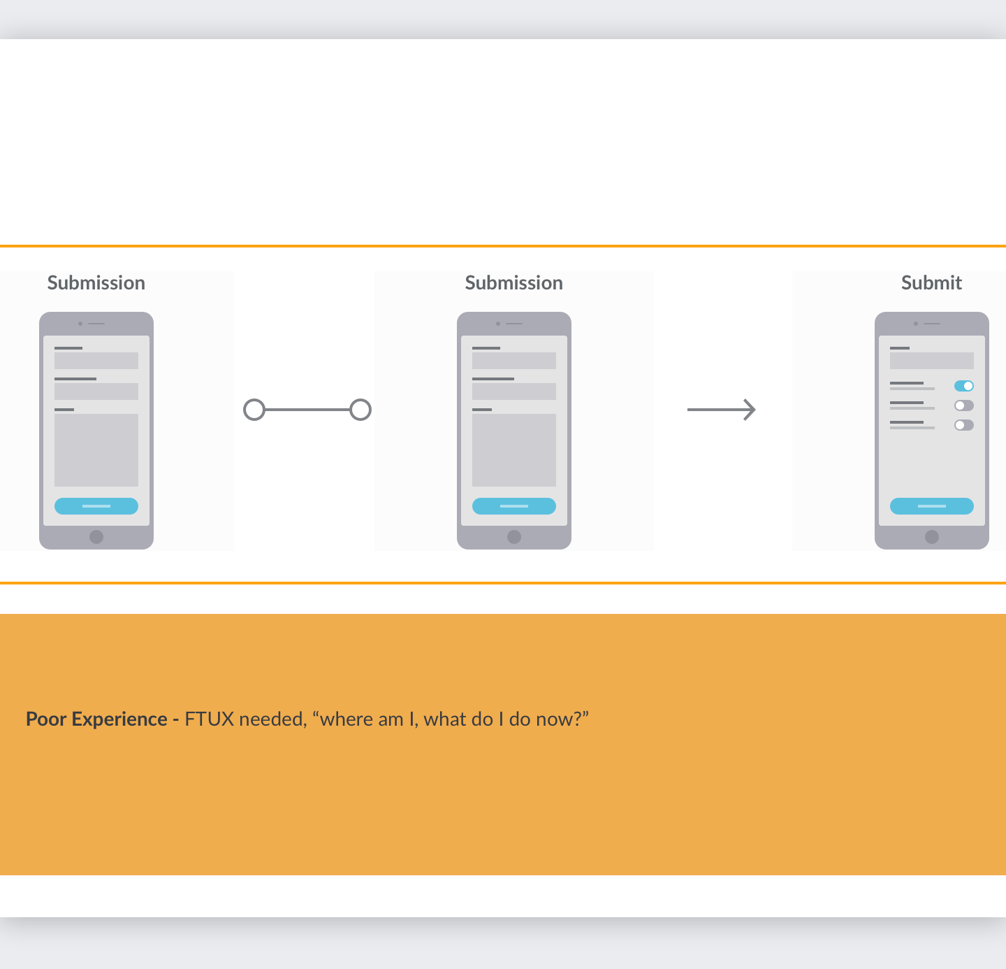
Poor IA contributed to:
User confusion around where they were while on-boarding
Lack of context when engaging with the form building tool
Sign-up abandonment
Collaboration 👥
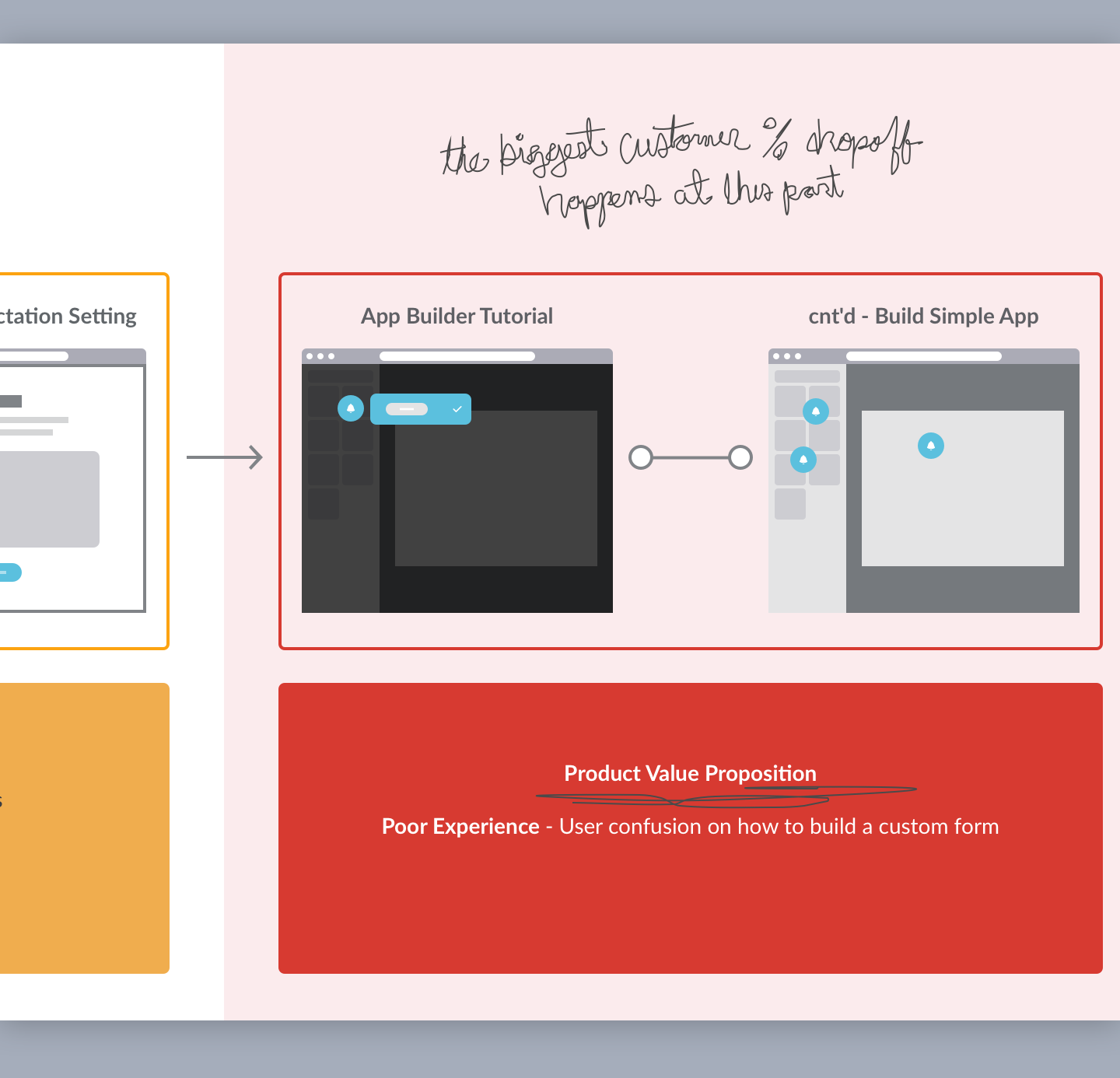
Because of time constraints, development capacity, and stakeholders, our team could only focus on one aspect of the above user journey to fix. Initial brainstorming centered around trying to solve the repetitive difficulty that users had with the main value proposition tool, the App Builder, since it was the most severely impacted part of the user journey experience.

This led us to thinking that the mental-model of digitizing a paper form on the GoCanvas platform was the primary problem that needed to be addressed. If customers were able to have some clarity around their first-time experience with the App Builder (value proposition), then they would complete the trial sign up (key metric for success).
We started by revamping the existing app builder onboarding experience with a rough wireframe of a "getting started" app builder tutorial that could address the above issues. As a result, the new onboarding flow would have the customer completing sign up, leading them to the App Builder, which would initiate the tutorial that walks them through how to use the software.
Takeaways 📚
Avoid scope creep; focus on fixing what will have the biggest impact
If a user knows how to use the thing they are signing up for = then more people will finish the sign-up process
Create a first time experience around adding clarity on how to use the builder

Hypothesis 🔍
If customers have clarity around their first-time experience with the App Builder (value proposition), they would complete the trial sign up step (key metric for success).
Early Concepts 💡
The goal was to balance stakeholder requirements (conversion, remember?) with user needs. Our team iterated on different wireframes that educated and aligned users on basic skills they would need to be successful, while simultaneously emphasizing behaviors that raised the chances of them converting from a free trial account to a paid account. Those behaviors were centered around answering the following questions, once in the App Builder:
• What am I looking at?
• What’s a workspace?
• What’s a screen?
• Whats a field?
• How do I add a field?
• How can I customize a field?
• How do I move a field around?
• How do I fill out what I built?
• What do I do next?
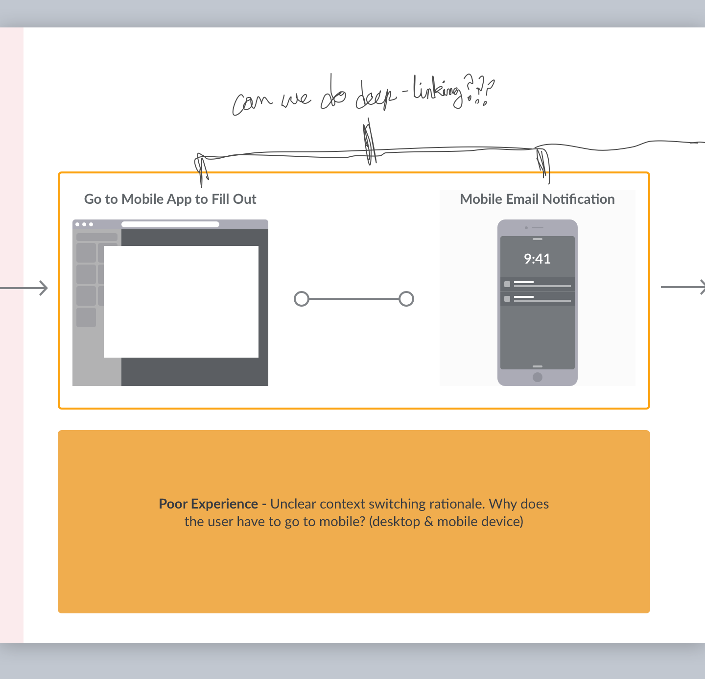
[fig 03, 04, 05, 06] Roughs of tree logic & wireframe prototype ideations to get a sense of what a tutorial should be (interaction rhythm, content, verbiage, affordances, etc.)

[fig 04]
[fig 05]
[fig 06]

We were wrong. 🛑
Our team had overlooked a crucial fact; GoCanvas users span a wide range of technical proficiency and age demographics. With so many different types of personas going through the sign-up funnel, it was presumptuous to assume that users knew what this technology was, let alone how to use it. For example, if a person believed horses were the only way of transportation and then one day received a Lamborghini, they wouldn't initially want to know how fast it goes; they'd want to know what in the world they were looking at.
Our focus pivoted, and our hypothesis shifted. We needed to set the table and establish the mental model earlier in the onboarding journey, which would result in a lift in sign-up completion and conversion percentage. With limited development capacity as a restriction, we needed to prioritize and focus on an element that could have the most significant impact, with positive downstream effects to the rest of the experience, even if it meant that a portion of the journey was left untouched.

Hypothesis 🔍
If customers were able to have clarity around their first-time experience with GoCanvas, they would complete the trial sign up (key metric for success).
Wireframes and Flow Ideation 💡
![[fig 07]](/s/Refocusing-Flow.png)
[fig 07]
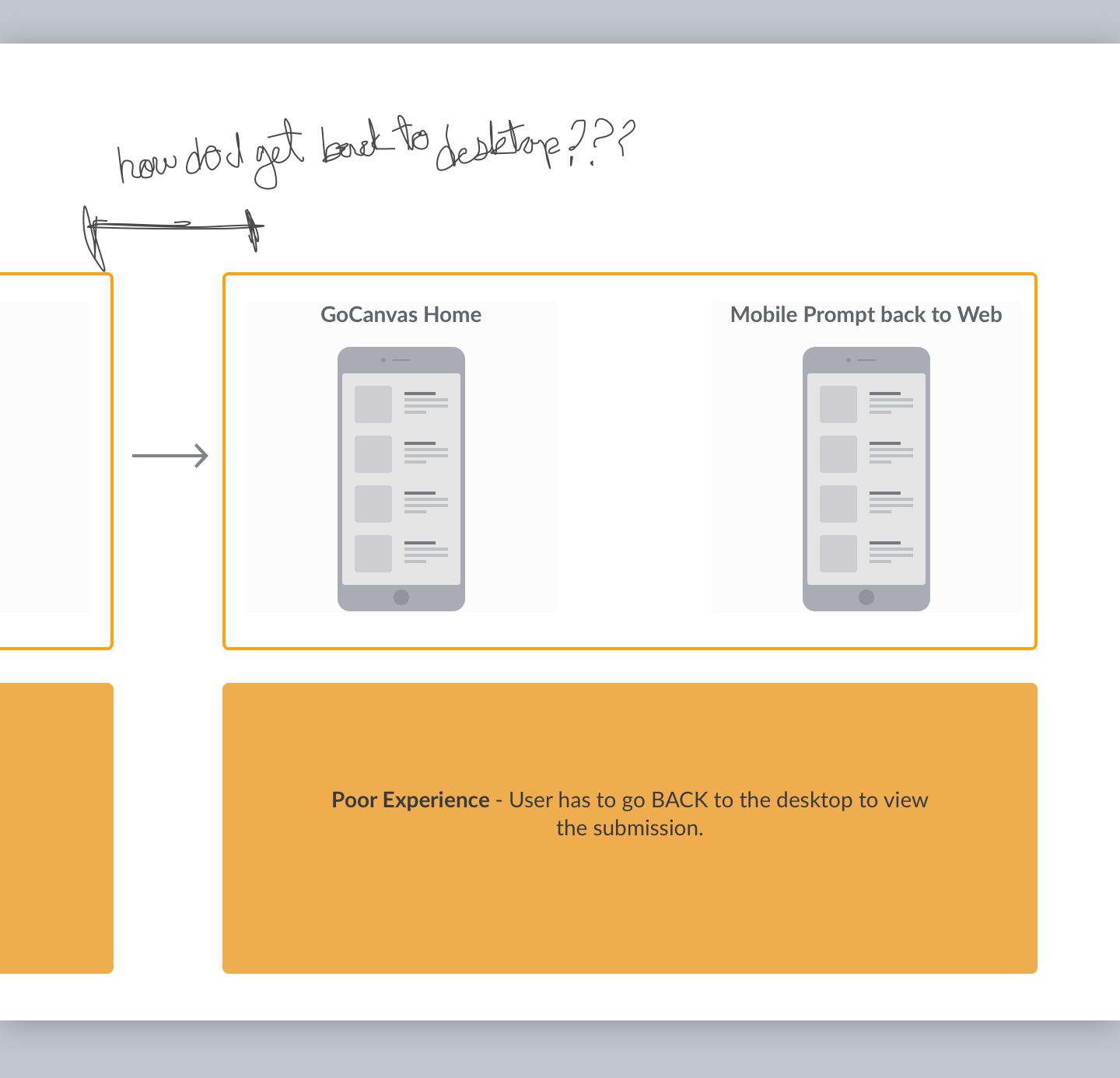
The focus became restructuring the entire sign-up process by cutting out unnecessary steps. When first buying the GoCanvas software, does a customer need to know exactly how the App Builder works (customizing a form) OR do they need to know how, at a high level, the entire GoCanvas product works (add a form, fill it out on mobile, and see the data)?
[fig 07] User research has shown that our users crave saving time, above all else. So we opted to skip showing the App Builder in its entirety and show how the entire process works instead.

![[fig 08] Wireframes of the step-by-step logic](/s/App-Setup-Rough-Prototypes.png)
[fig 08] Wireframes of the step-by-step logic
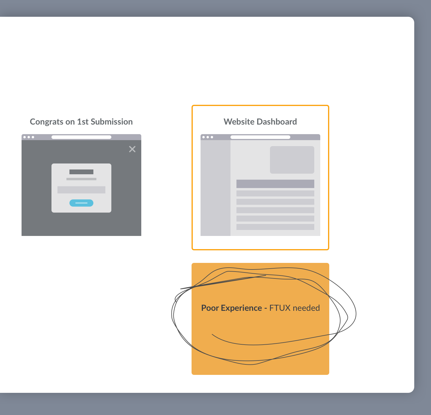
After multiple variations, the team settled on structuring this onboarding set-up flow under three phases; Set-up, Fill Out, and View. Parsing out the steps this way meant there were more screens overall, but keeping it simple made the cognitive load easy for users to understand and provided further context as they progressed through signing up. This approach covered the necessary pain-points, and expedited the sign-up process. Sometimes, more is less.
Final Prototype


Results 🥇
After implementation, the impacts were a 65.6% increase in trial sign-up to download and 8.1% lift from trial to purchase. People found that the new App Set up flow to be easy and straightforward and the continued iteration has been a great success.