Background:
The App Builder is a web-based tool that’s used to create custom digital forms to be filled out on mobile devices.
Role: UX Designer & Researcher

Problem 💣
The ask was to re-think the app builder as it would function in the near future, while providing a better user experience. The problems with the current App Builder was that users often found that it was clunky, hard to use, and the mental model was difficult to comprehend.

Project Plan

UX Research Goals
Identify existing pain points from collected user research and heuristic evaluation
Conduct collaborative ideation/research sessions with internal product experts
UX Design Goals
Hypothesize and create wireframe solutions based on research
Refine wire-frames and prototype simple interactions that summarize new builder direction
Deliverables
Wireframes
Prototypes
Pitch to stakeholders
UX Research ⚡️
After diving into user research and reviewing data from multiple usability tests of the app builder, it was clear that most issues fell within the following thematic areas.
The interface is hard to understand, terminology is unclear, and there was a persistent mental-model confusion (filling out a form vs. creating a form for someone else to fill out).
Existing Builder Pain-Points
01. Customers understood “Form Builder” as the replacement for “App Builder” more frequently than “Form Editor” or “Form Designer”
02. Figuring out features in the builder by trial and error because the introduction walk-through did not touch on pieces contextually, when needed.
03. Lack of visual affordances to know if field types are grab-able to drag to the workspace.
04. Frequent typing into the field type boxes in the app builder because people think they’re filling out the form.
05. Difficulty figuring out how to delete a section.
06. Difficult to rearrange/edit sections in the App Builder.
07. Getting immediately dropped into the App Builder, with no context, is confusing.
08. Building apps takes time, which is in short supply for some people.

Collaborative Research + Ideation 👥
As stated prior, we wanted to make sure that we addressed the above pain-points and make it with the future in mind. To continue to do this, we needed to find out functionalities that our app builder falls short on that, if possible, would add a significant impact to the business.
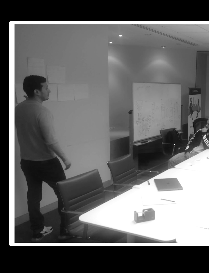
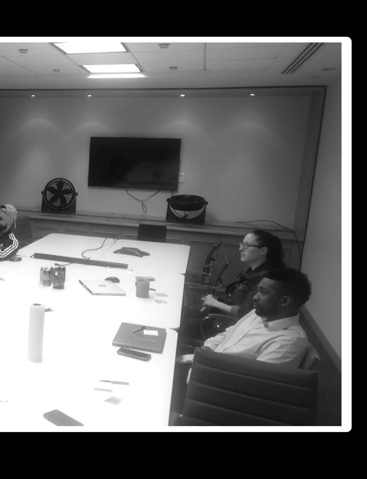
To find this out, we ran a quick research activity with some internal product experts. We identified key employees who have a high knowledge base of our current app builder and interact with our customers regularly.
We asked each of them to draw their own ideal version of the App Builder. Once all sketches were drawn, they pinned them up on the wall, spoke about their rationale, and then we all placed sticky notes on parts of each drawing that we liked. After hearing and reviewing all of the ideas, we then had them collaborate together to combine and sketch their perfect app builder version.
After combining all of the sketches and ideas, we synthesized them down to the core features that would add a significant value to existing users of the revamp of the app builder.
Session Takeaways 📚
Need a way to have preset groups of form fields for quick application
Have qualifying questions that auto build the form before getting to the builder
Include a way to do a quick test submission

Hypothesis 🔍
The future App Builder needs to be easy to use (via usability research), smart enough to assist completing the primary goal (via collaboration sessions), and clear on its functionality (establishing the mental model).

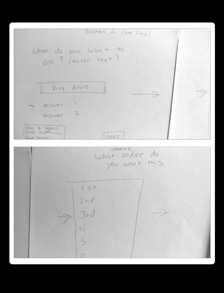
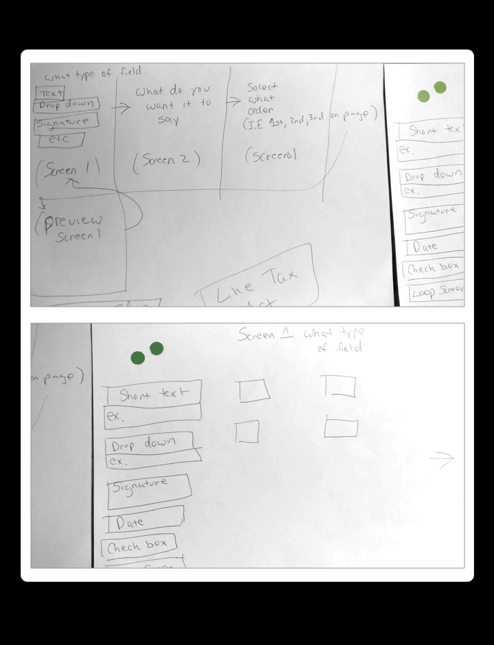
Wireframe Ideation 💡
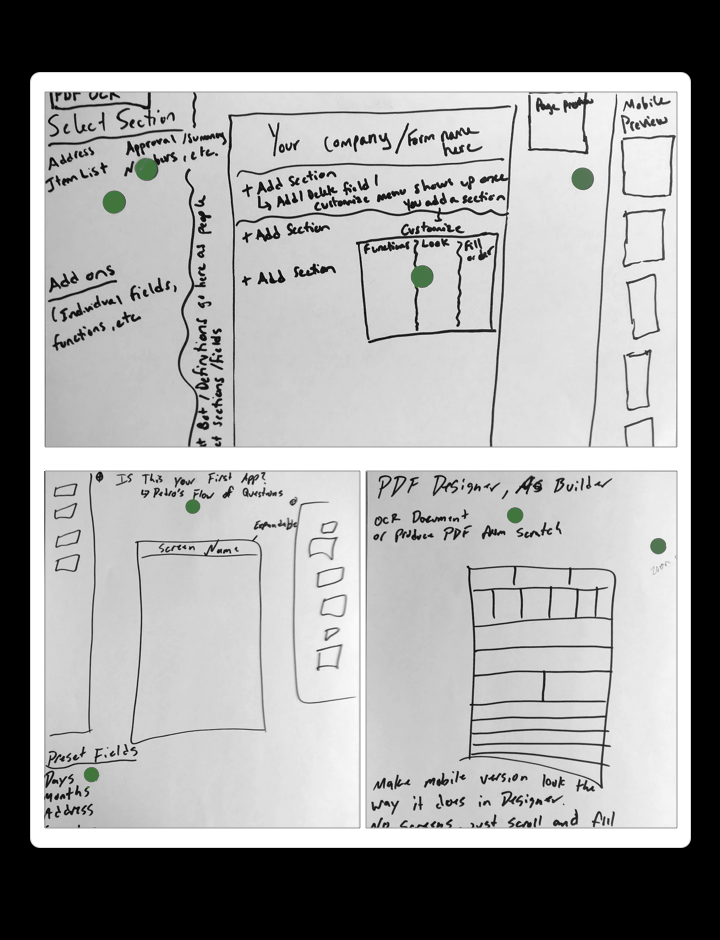
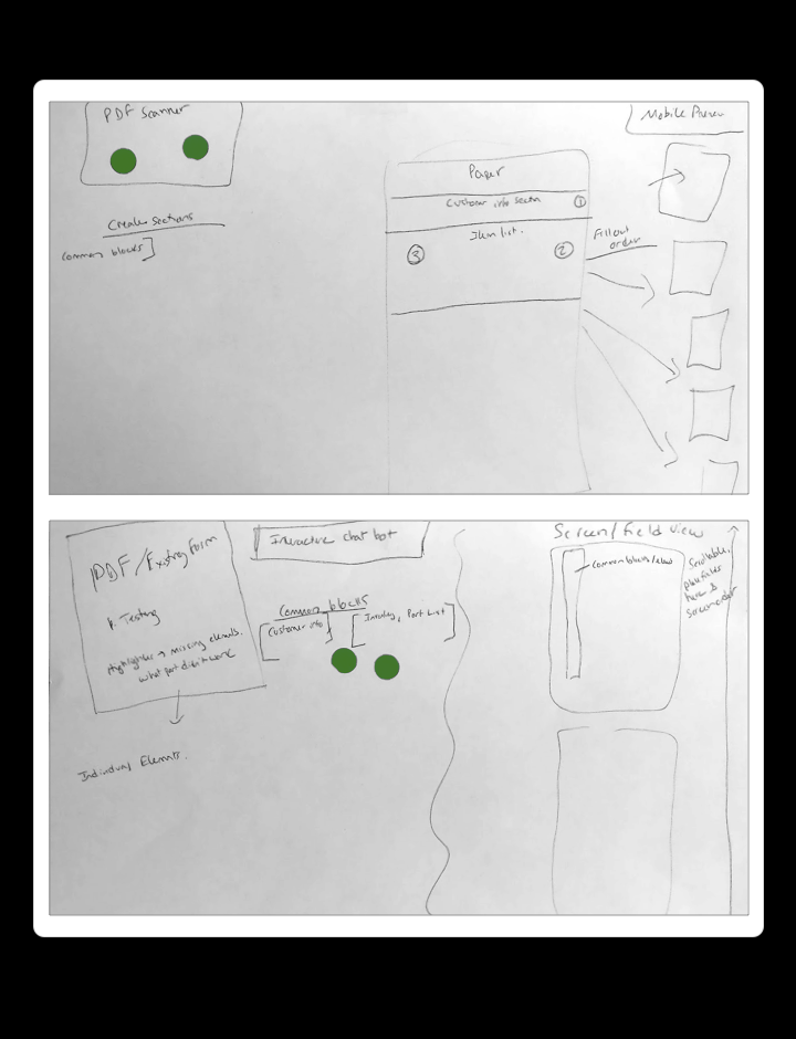
Our team pitched a set-up flow to benchmark the process of creating a digital form. These screens were crucial in giving the user context of the overall form building process. Letting them set up groups of fields before they even saw the builder allowed them to hit the ground running and provided a smooth incline for them to start customizing before seeing anything visual, thus making the mental model easier to digest.
![[fig 04] Wireframes](/s/Wireflows.png)
[fig 04] Wireframes
![[fig 04] Wireframes](/s/Rough-Protoypes-9xst.png)
[fig 04] Wireframes
![[fig 04] Wireframes](/s/Groups-of-fields-Copy.png)
[fig 04] Wireframes
Workspace Backdrop - Through the lens of the existing offering, we're asking users to leave behind a process that they've been using for years (paper is ancient, historically speaking) and understand new software and a new process quickly. Why not meet them halfway? By considering UI & interaction patterns to resemble something familiar, we believed that having a simple "paper" as the backdrop to where you build your form would be a more effective way for users to realize the value proposition faster and more effectively.
Field Groupings - With a new UI wireframe interface theorized, we then recalled the research, pain-points, and collaboration that we uncovered earlier. Most paper forms have similar groups of fields that are replicated, such as general customer information, for example. This customer information field group typically has input fields such as name, address, city, state, and zip code. In the current GoCanvas app builder, you build forms field by field. Very slow and cumbersome.
The unfamiliarity of building a form by selecting a field, choosing a field type (ex. selecting drop-down field vs. a blank field for typing), within the context of replicating a paper form on a computer wasn't resonating with users and needed re-thinking.
Leaning on our hypothesis; given context, if you could add groups of fields in addition to single fields when creating forms, saving and/or storing those groups for use when building other forms, it would make form building more efficient and contextual.
The simplified interface greatly reduced the amount of visual clutter that existed in the old. Easing the cognitive load by nesting field settings and options within the workspace was a huge space saver.
Final Prototype


Results 🥇
This project was a success. It convinced stakeholders to start integrating aspects of the above prototype into the current app builder experience (on an iterative basis). The first, was a user interface and interaction pattern overhaul (field types UI and visual affordances) and second, was the focus on establishing the mental model of building a form. These incremental changes in the app builder have been testing well and the most recent usability sessions have shown that 5/5 participants understood the mental model of building a form, built an example paper form, and completed all of the tasks in the session.