Background:
The app store is a form template library in the GoCanvas platform that aims to save time for users by providing pre-built forms that you can add to your account and customize as you like.
Role: UX Designer

Problem 💣
The form template library has been an area of confusion for GoCanvas customers for some time. What is its value? Is it oriented to serve existing GoCanvas users by saving time, or is it better served as a website entry point to grab prospective users who are unsure if GoCanvas fits their use case? Why is it called “App Store”? Unfortunately, these questions don't receive any clarity with this project. Still, the direction of the app store as it relates to the overall product strategy was kept in mind throughout the duration of this project.
The current offering of the app store focused on just capturing traffic from SEO optimization for years, and the information architecture and overall clarity had suffered significantly. Blocks of text for SEO and other archaic methods of grabbing traffic had defined the experience, and as a result, traffic began slowing, and a redesign was needed.
Project Plan
Notable Constraints
Form template pages that were high performing still needed to be crawl-able by SEO to drive traffic
Back-end development, while flexible, would need to keep the structure of the code as-is or as low of a level of effort as possible
Multiple-use case considerations and entry points into the App Store made flexibility of the layout a high priority
All UX design updates needs to work on mobile web
UX Design Goals
Hypothesize and create wireframe solutions based on research
Product Strategy, Research, Wireframing, and Prototyping
Deliverables
Wireframes
Prototypes
Pitch to stakeholders
UX Research ⚡️
The focus was to ensure that users always, at the minimum, can find a form template smoothly and efficiently. That meant focusing on the poor information architecture. The developers were already improving search functionality and by implementing elastic-search. At a high level, some outstanding usability questions that needed addressing were:
Where am I?
The top header area gave no context into what the was looking at on the webpage.
What else can I do here?
No direction to give the user an indication of exploring further. Terminology was confusing. Apps? Forms? Templates?
Where do I go?
There was an array of 5 primary filters that catered to edge cases and gave no indication of what to do first. CTA's that launched modals with interactions design elements that showcased multiple instances of cognitive overload.
What is all this stuff?
By default, form templates were uncategorized and listed with a 24 per page with 1301 pages listed with minimal context. That's way too much.
Research has shown 📚
All of these qualitative data points corroborated the pain-points that we aimed to solve.
Users don't want to waste their time looking at software that won't work for them.
Users don't read the description on the app store page because it's too long and scrolls to a more relevant part of the page.
Users expect search in the application store to work with any keyword and within the filtering/page because of their experience with other digital platforms.
The System Usability Scale (SUS) for the Application Store was 61, lower than the industry average (which is 68).

Hypothesis 🔍
Improving the functionality for users to find form templates will improve the overall experience and increase the number of trial sign ups from the App Store.

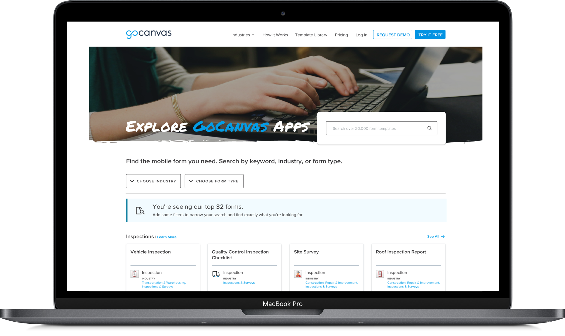
Wireframes💡
![[fig 04] Wireframes](https://images.squarespace-cdn.com/content/v1/5e6065103f92890cfc414312/1593845591183-VZVTII24MYN4JFK6DVHW/Wireframes.png)
[fig 04] Wireframes
The default categorization of the homepage templates is by form type. Each grouping displays four of the top forms in that form type with a link to see more if a user chooses. This organization and structure gives users greater context and understanding of what they're looking at when browsing the page.
Focused on two methods of filtering, by Industry or by Form Type. The argument that a user wouldn't likely select more than one industry was compelling. Still, we didn't have enough evidence to support that the restructuring of these filter options in a tiered way would be more successful.
Lastly, we ditched showing all of the other filter options upfront because of their infrequently use and irrelevance at this level. Additional filters progressively disclosed, depending on how deep they continue to browse the app store (ie, the sub-industry filter doesn't appear until you have an industry selected).
Eliminated the modals. The modal in the old format took users out view on what they were attempting to change. We replaced that with a drawer function that pops down when selecting a filter option, electing to keep the app templates visible that a user was curating.
New interaction patterns. The new CTA's can simultaneously initiate filter choices and display what’s affecting the displayed results.
Adjusted the search bar to be the first thing that users can interact with when landing on the page. Analytics showed that 91% of the interactions on the App store were on the search bar, so we wanted to give that priority in real estate.
Below that, we introduced new content blocks to provide context on what courses of action users could take on the page and to clarify what users were looking at, at a glance. Form categories also surfaced a "Learn More" link to add some frame of reference around the categorization.
The mobile web iteration was a slight adjustment because screen real-estate became a priority. Stakeholders were adamant about the results being at least partially visible above the fold without decreasing the size of the header. Multiple variations on the sizing of the header, tiles, and filters were all considered.
Ultimately, they decided on the larger header approach that was consistent with the other pages on mobile while laying the ground-work for a new brand (which is still in development).
We nested the filters within a filter icon. With so many select-able options listed in filters, the best approach was to give it a full-screen real-estate for clarity and ease of use. We also opted to structure the initial landing page in an accordion format to show a user the top forms without making the mobile page incredibly long.
Final Prototype


Results 📊
Overall feedback has been positive. However, this project is still in progress —will update when there’s more information around success metrics. (🤞)