Background:
The GoCanvas Help Center is for users who need clarification and assistance with using the GoCanvas Mobile Application and the desktop website. We were migrating over to a popular platform (Zendesk), and had to optimize it to make sure it answered user needs.
Role: UX Designer

Problem 💣
The current help center and community were ineffective at empowering users to research and resolve issues. The support team was constantly fielding phone calls from users regarding easily solvable items. Additionally, most users were aware of the help section and had attempted to figure out their issues before calling.
Project Plan
UX Research Goals
Research and explore traditional help website best practices and identify problem areas to address
UX Design Goals
Improve and iterate on the ease of use to which users can access help topics/issues
Deliverables
Wireframes
Prototypes
UX Research ⚡️
Where am I, what am I supposed to do, and what else is there?
Terminology isn't regular; GoCanvas has tons of platform-specific features, and the functions are named with that specificity in mind, without validation of end-user comprehension. Meaning, the vocabulary isn't universal.
Too many choices; feature-itis; In the old help center homepage, there were 19 different category call-to-actions. Presenting users with so many topics and pathways at once can make things intimidating and confusing.
The Help Center is supposed to be the first stop when a user is frustrated. With poor information architecture and feature-itis plaguing users from achieving their goals, those problems were addressed first.

How did you understand user pain-points?
The approach was to pull data from the previous year to pinpoint which of the 19 topics listed were the most clicked on. Taking those results and triangulating them with interviews from our support staff, a comparative analysis determined whether the questions and attitudes they received from users matched up with the data. Those insights helped to fill in the gaps in our knowledge base about the help center before our team got started.
Migrating to the Zendesk platform solves most of the information architecture issues. Zendesk structures its platform by hosting information in a three-tiered format; section, category, and knowledge article. (3 layers deep is the best practice for users to find what they need quickly)
After looking at our personas technical acumen range, our team confirmed that there are three levels of proficiency when it comes to the product: beginner, average, and power users. How can we expedite each of them getting to where they need to go?

Wireframe Ideations 💡


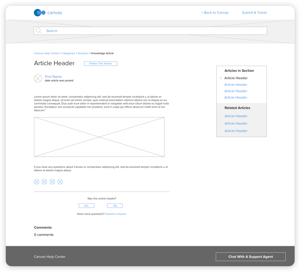


[fig 02] Wireframes
A robust search bar assists all level users in navigating immediately to their issue. From a competitive analysis standpoint, other websites have chosen the search bar to be the primary vehicle for users to find what they want quickly and effectively. The term 'googling' has become synonymous with finding out answers you don't know, so we relied on that current day affordance to go with a well-designed search bar to bear the brunt of how people find helpful articles.
As stated prior, data showed that only 8 of the 19 CTA's on the front page received heavy real traffic.
As a result, we limited the offering on that page to just 8 - The breadcrumb visibility throughout a users' exploration will help bolster information architecture by orienting where a user is, where they can go, and what else they can do on any page.
Collaborating with another UI designer, we made sure that the design had a softer personality but was still on brand. We didn't want something so visually striking that it got in the way of finding a help topic but rather gave a calming effect.
Usability Testing 📚
7 Users Tested
Age 25-60
Varying CPU proficiency
I developed an interactive prototype in InVision and planned usability testing sessions. The goal was to find out if the new layout was more effective than the previous version. Additionally, while testing, we were keeping an eye out for any UI changes that could be implemented to improve usability.
The tests confirmed that the new design was user-friendly, easy to navigate, and effective in engaging users to find the assistance that they needed and explore other areas of the help center. Every user accomplished the tasks without complications or hesitations.
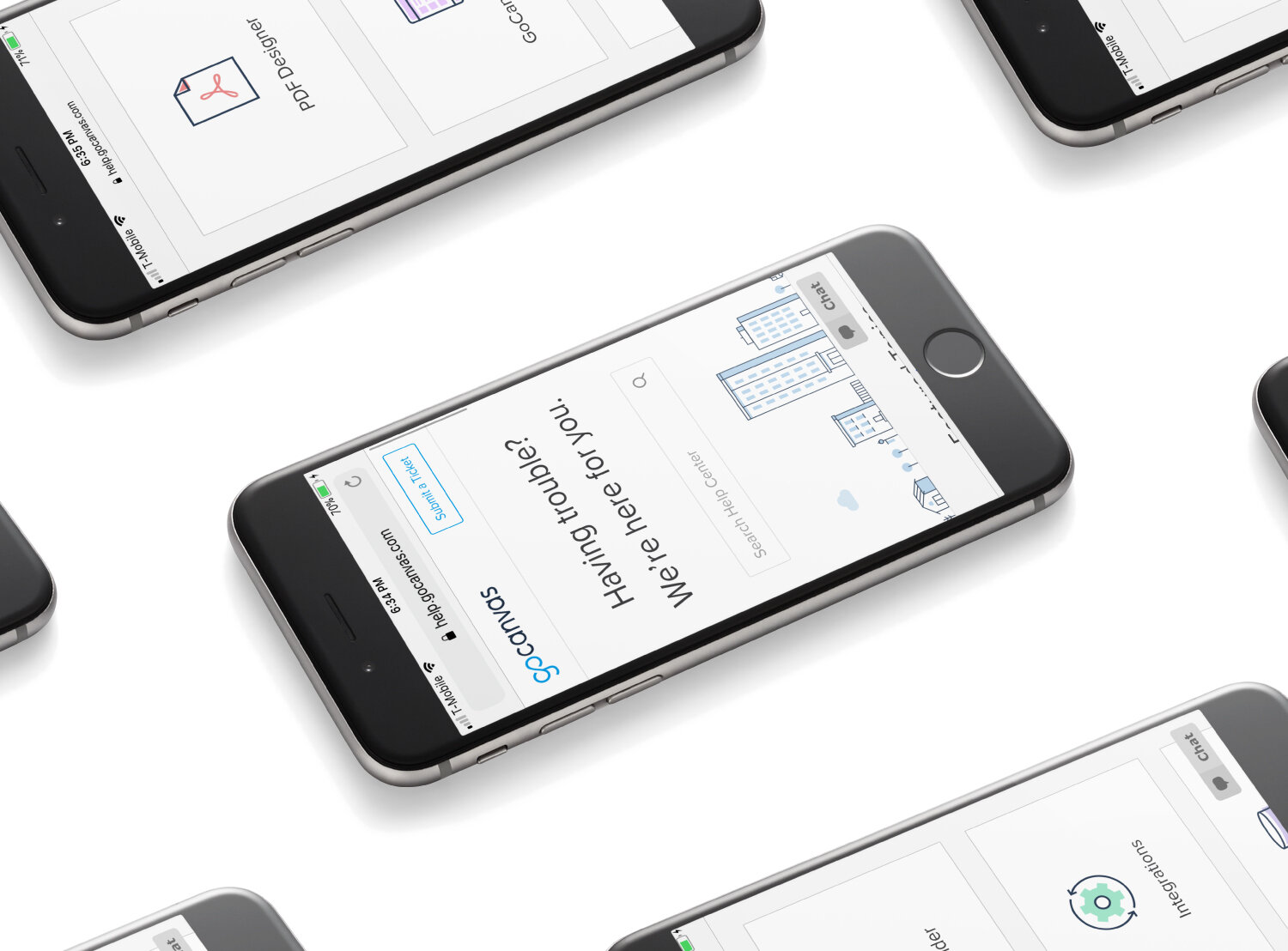
Final Prototype


Results 🥇
The number of calls to our support requests has dropped, and the metrics show that there is a higher usage rate of the help section.
The help center & community has grown in importance and is at the forefront of interacting with our growing customer base. It's now part of the GoCanvas Support team SOP of identifying small to significant tier level customer issues.
A bonus side effect is that the re-design has empowered micro-influencers in our digital forums to assist and raise issues and feature-requests to be integrated into the product.
The redesigned community & help center was interacted with 10,320 times from January 24, 2018–January 24, 2020, a 65% increase from the prior design.